Thursday, June 25, 2020

Pieces of Me

Today I am sharing my Pieces of Us project. I followed along with Ali Edwards' prompts in February for her self portrait adventure. 

I knew I wanted to make something with the images and words I had documented in Instagram over the week, and when I came across this sketching the Simple Scrapper membership, I knew I had the perfect layout design to work from.


I used some paper from Jen Hadfield, as well as some chip board pieces from one of her collections. I also found some stitched ephemera pieces that came from Maggie Holmes.

I stamped Pieces of Me using Story Stamps from theme of pieces and me. The "of" was stamped using partial inking of one of the stamps in one of those sets. I stamped in grey ink and used clear embossing powder to have it stand out a bit more. Gave it a different texture.


I added the prompts list as a photo to put the project into more context. To show it was more than just a thing I decided to do on my own.


I struggled with fitting all of my words on the layout, and the font was a bit tiny, but it worked for the space that I had allotted for it. I used some older Ali Edwards stamps that were the days of the week. Thought the handwriting matching the title worked nicely.

I have been taking Stacy Julian's 20 in 20 class this year. One of the projects she recommended for us to do in February was something about us right now. I thought this was a perfect project to do for the assignment as well as fit with the other "pieces' Story Stamp stories I was working on telling at the time.

Thanks for stopping by and checking out my layout!


Friday, June 19, 2020

Play Your Way

After my youngest was playing with this toy, the gum ball machine, I realized how different my kids were when they played with it. I could remember taking pictures of the older two playing with this toy, but wasn't sure about the Ally, my third child. Luckily I had, and luckily it showed how she had played with it in the photographs!

So I had the story I knew I wanted to tell and the photos to support it, then it was how to put it together.

Ali Edwards' Story Stamp theme for one month was Play, which was perfect to use with my story. Next, I had to decide on a layout design and products. 

I decided to do a two page layout. I had too much stuff with four sets of photos, and journaling for each. I decided to block it, where each child got have a page.  

When looking for paper, I wanted to find a pattern that was multicolored and had bright colors that reminded me of the toy. I found a stripe in Shimelle's Box of Crayons project pad, but couldn't find any subtle tone on tone patterns that worked with my story. There is colored card stock included in the pad, so I found ones in that collection as well as another (Glitter Girl, maybe.) That matched the stripes in the patterned paper.

I don't tend to use colored card stock much any more, preferring more depth with patterns, but decided it was a good opportunity to create my own patterned paper with the Play themed Story Stamps from Ali Edwards.

This is what I created. 


I debated on whether to create a repeating pattern or make it random. I chose the repeating pattern, knowing I would most likely like the overall look better if it repeated. I also tested some of the paper out with some Distress Inks to find a good match to the color of papers that I had chosen.


Really love how it turned out. I felt a bit disappointed that so much of it got covered up! Will definitely be doing this technique again and will select a design that will give it more room to shine next time.

Here is the final layout!


For the title, I found a Thicker phrase from Shimelle, that said play and some old Simple Stories alphas to create the rest of the title.

The title rests on a die cut I created using a Tim Holtz Sizzix die.

Because I had so many dates on this page, the dates of each set of photos, I wanted to include what day I journaled this story. I used a new stamp set from Everyday Explorers National Scrapbook Day bundle to add that. I tucked it in above the two photos of my son. Seemed like the best fit for the layout.


Another element to this layout that I was excited about was the stamped and paper pieced gum ball machine. The stamp is from Lawn Fawn. I had loved the fact that the stamp set came will all kinds of different faces to give the gum balls, and had no real thought to using it in this way when I bought it.

It wound up being a perfect embellishment for this story! I stamped it multiple times on each of the color card stocks and cut the pieces out and pieced it together. I am not much of a stamp colorer, so this worked best for me. Later for an embellishment around my photos, I stamped more gum balls and scattered them around the page.


For each child, I die cut their names using some old alpha dies from Quickutz. I stamped the date the photo was taken under that. I debated on whether I should add their ages under that, but they were all between 9 months old and a year and wasn't sure how to add it without complicating my design.


I found a journaling card for each child and gave it a subtitle with how they played with the toy. My kids got a kick out of them when they saw me putting this layout together, loving to hear how they played with it and how that was different from the others.


In repeating elements of the first page, I added two more View Master Reels and some heart Thickers from the same pack as the play word.


Love how this turned out! Super fun layout to make and love the story that it tells! 

Thanks for stopping by to take a look!


Friday, June 12, 2020

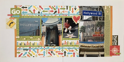
Hollywood

Sharing another layout with you that was a kit from Scrapbook Generations. This was the third layout I had from this trip set to go and this was the one I could not get to work with the old products I had. With the other layouts redone, it was easy to select this kit to go with these photos. 


I did some tweaking to this layout as well. I had more photos and words to put on the page than initially intended. I struggled to fit the photos I had into this kit, but I am happy with how everything fits and works well. 


I switched up the title cards and added these squares to work with the right bottom corner. I added the wood veneer arrows to add dimension to an otherwise flat design.


I always have more to say on a layout than I really have room for, so I created a journaling strip and extended the layout on both sides with some orange patterned paper left over from the beach layout I shared below.


Added some more arrows, in part because my printer was giving me fits since the card stock was too thick to pull in correctly and center it. It made the printing seem more on purpose and part of the design.


Finished it off with a few more square tiles to match the title and called this set of layout complete. So happy to have this and the other 2 layouts out of that Pages in Progress pile and into an album!

Off to complete some more! Thanks for stopping by!


Wednesday, June 3, 2020

MZMommies

Sharing a layout here today that has been in my pages in progress pile. It is by far one of the more recent to be added, but it made it to the pile because I was having trouble finding the date the photo was taken. Luckily, when searching the date for another layout, I happened across this one!

I believe this layout was initially inspired by an enlarged photo layout by Shimelle. I believe Glitter Girl may  have solved the day with this one. 


Papers on this layout are from an Amy Tangerine collection, the dies are from an SCT Sampler kit filled with Vicki Boutin die cuts, stickers are from Amy Tangerine’s sticker book and a few puffy stickers from Elle’s Studio.


Used some of my favorite Thickers for the title and added the date with some stamps.

Love to have this one done, the story told and in my album!